
Cake Design Directions
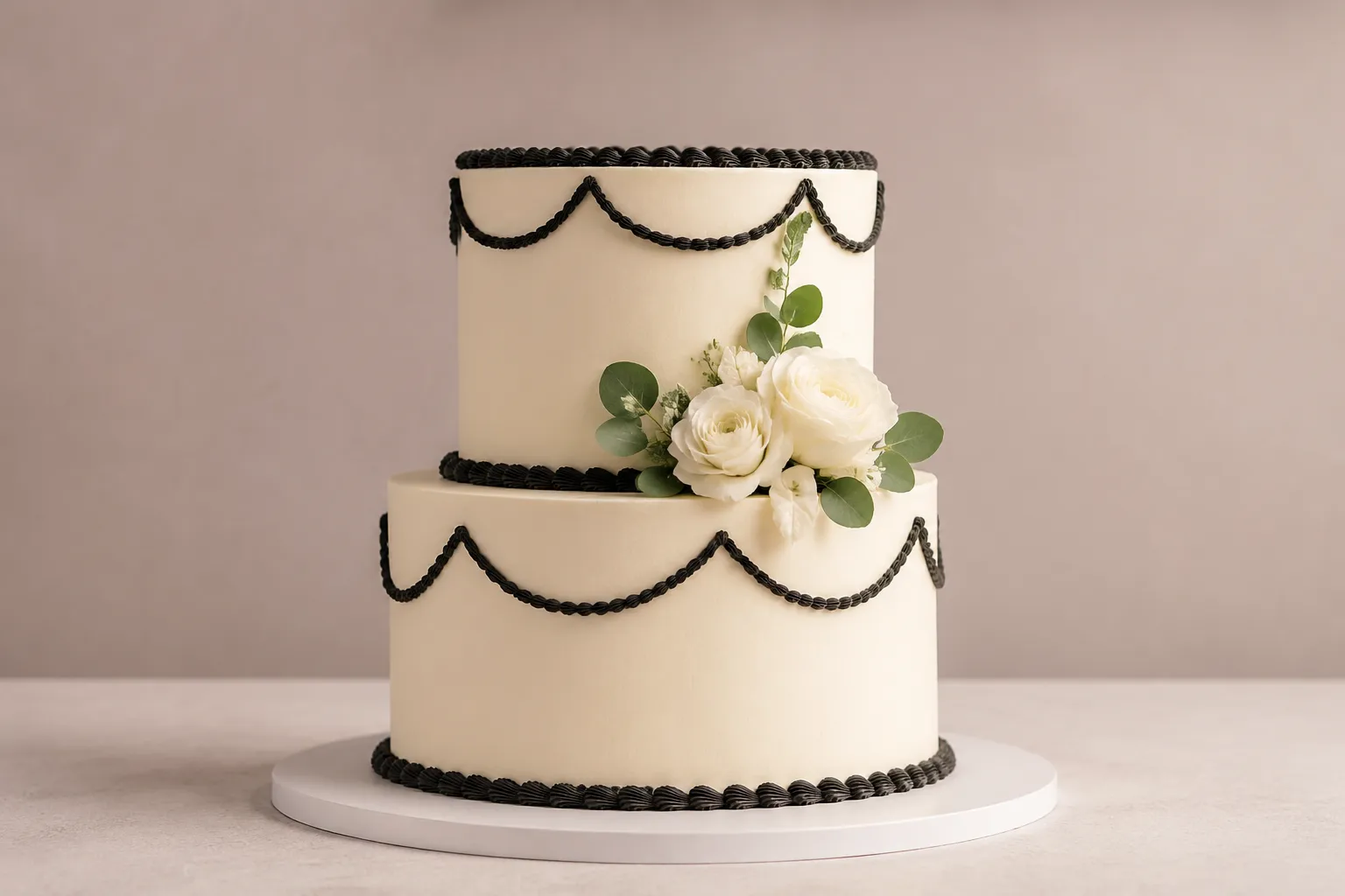
A cake reference can show a silhouette, surface, color relationship, or decorative arrangement. It cannot, by appearance alone, confirm the ingredients, taste, serving quantity, structural stability, transport plan, price, or exact production method.
That distinction makes cake design planning more useful. Instead of sending a bakery one image and a broad adjective such as "modern" or "simple," translate the preference into visible decisions: profile, tier ratio, edge, finish, piping density, scale, spacing, placement, and focal detail.
This guide gives you a shared framework for developing cake design ideas and turning them into a practical cake design brief. Use it to identify the right design route, compare plausible options, review a preview, and prepare focused questions for the producing bakery.
More specific pages
These pages continue the topic in smaller, more specific directions.
Start With the Visual Direction
Begin with what can be seen. A useful reference review separates the cake into five connected layers:
- Silhouette: the outer shape and overall profile.
- Proportion: the relationship between height, width, tiers, and visible gaps.
- Surface: the finish, texture, edge treatment, and degree of regularity.
- Decoration: the motifs, lettering, flowers, figures, piping, or applied details.
- Color system: the main color, supporting colors, contrast, and strongest focal point.
First identify what kind of reference you are using. A photographed finished cake shows a particular result. A sketch, collage, generated image, or digital rendering may communicate direction without establishing the final appearance.
The first brief should describe the intended visual relationship rather than promise an exact copy. For example:
A two-tier cake with a relatively tall profile, a smooth light surface, sparse dark piping, and one concentrated floral detail near the upper tier.
This gives the bakery more usable information than "a sophisticated cake with flowers."
Five Routes for Cake Design Ideas
Most cake design ideas can be organized through five routes. They overlap, but each begins with a different decision.
| Route | Start here when... | Describe... |
|---|---|---|
| Silhouettes and tier proportions | The outline, height, or relationship between tiers is unsettled. | Profile, tier ratio, outline, edge, and visible spacing. |
| Finishes and surface textures | The exterior surface carries most of the visual direction. | Texture, sheen, direction, regularity, coverage, and edge treatment. |
| Decorations and placement | The main issue is focal detail, piping density, scale, or arrangement. | Type, position, direction, scale, density, and open space. |
| Theme translation and personalization | An event or personal reference needs to become a coherent cake language. | Direct, moderate, or subtle references through form, color, pattern, or motif. |
| Color and visual focal points | The palette, contrast, or hierarchy is unclear. | Base, accent, contrast, lettering, decoration color, and the first point of attention. |
These routes are planning categories, not separate formulas. A tall profile may need a different decoration scale. A textured finish may reduce the need for dense patterning. A literal theme may work better with a quieter color system.
Silhouette and Tier Proportions
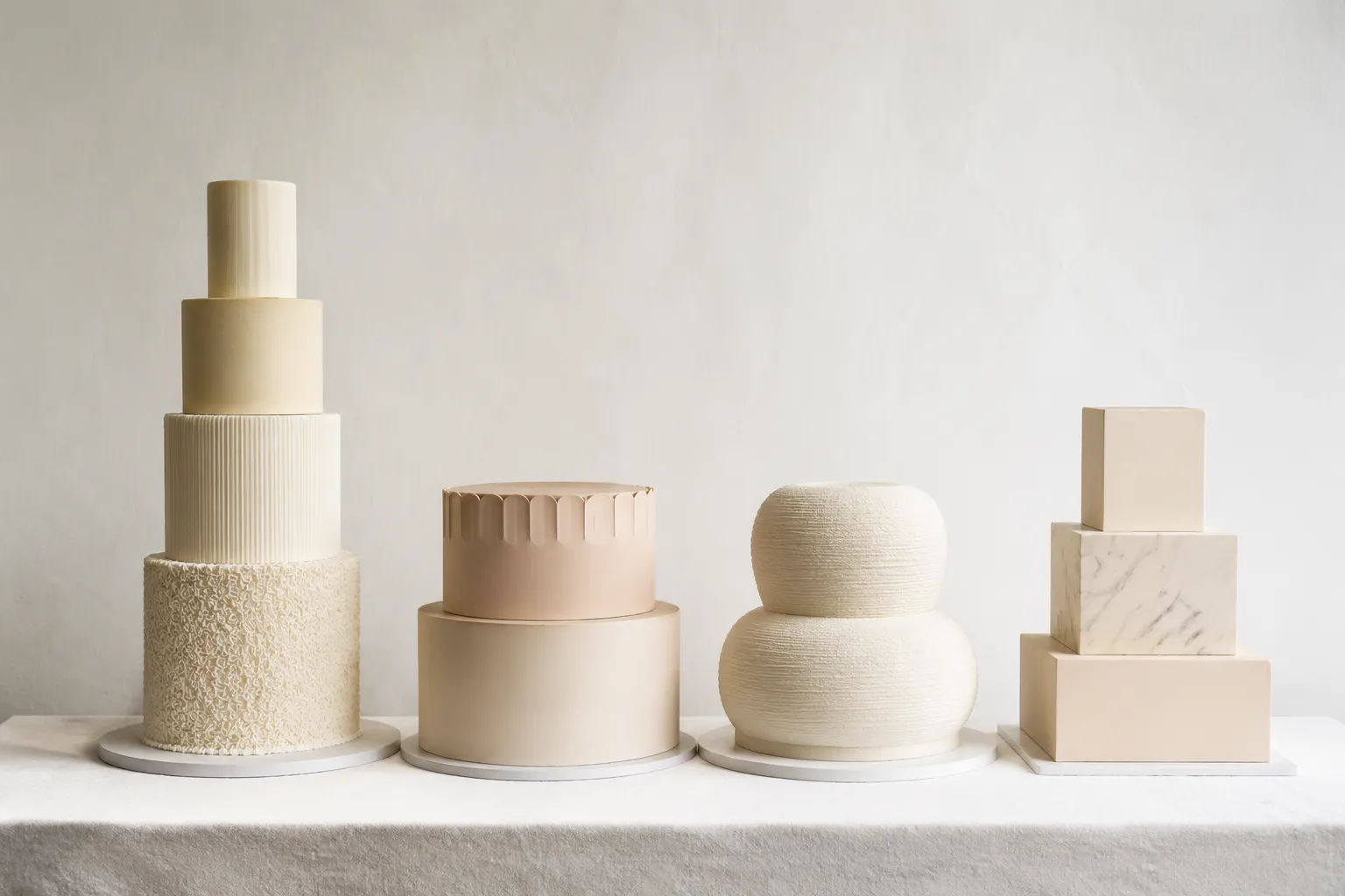
The silhouette establishes the cake's first read. It includes the outer outline, the shape of each tier, the relationship between tiers, and the amount of visible negative space.
Useful comparisons include round, square, oval, or irregular outlines; tall and narrow versus low and wide profiles; closely stacked versus visibly separated tiers; and even versus deliberately uneven tier ratios.
Tier ratios describe how one tier relates to another in width and height. A narrow upper tier over a wider lower tier creates a different visual rhythm from two tiers with similar widths.
| Criterion | Option A | Option B |
|---|---|---|
| Outer outline | Rounded | Angular |
| Overall profile | Tall and narrow | Low and wide |
| Tier relationship | Strong width contrast | Similar widths |
| Visible spacing | Minimal | More open |
| Likely focal area | Upper tier | Center decoration |
The reference does not establish whether a particular ratio is suitable for the intended size, filling, finish, venue, or handling conditions. Ask the producing bakery which profile can be assessed for the actual brief.
Finishes and Surface Textures
The finish controls how light breaks across the cake. It may appear smooth, ridged, brushed, folded, ruffled, stippled, rough, glossy, matte, or layered with visible bands.
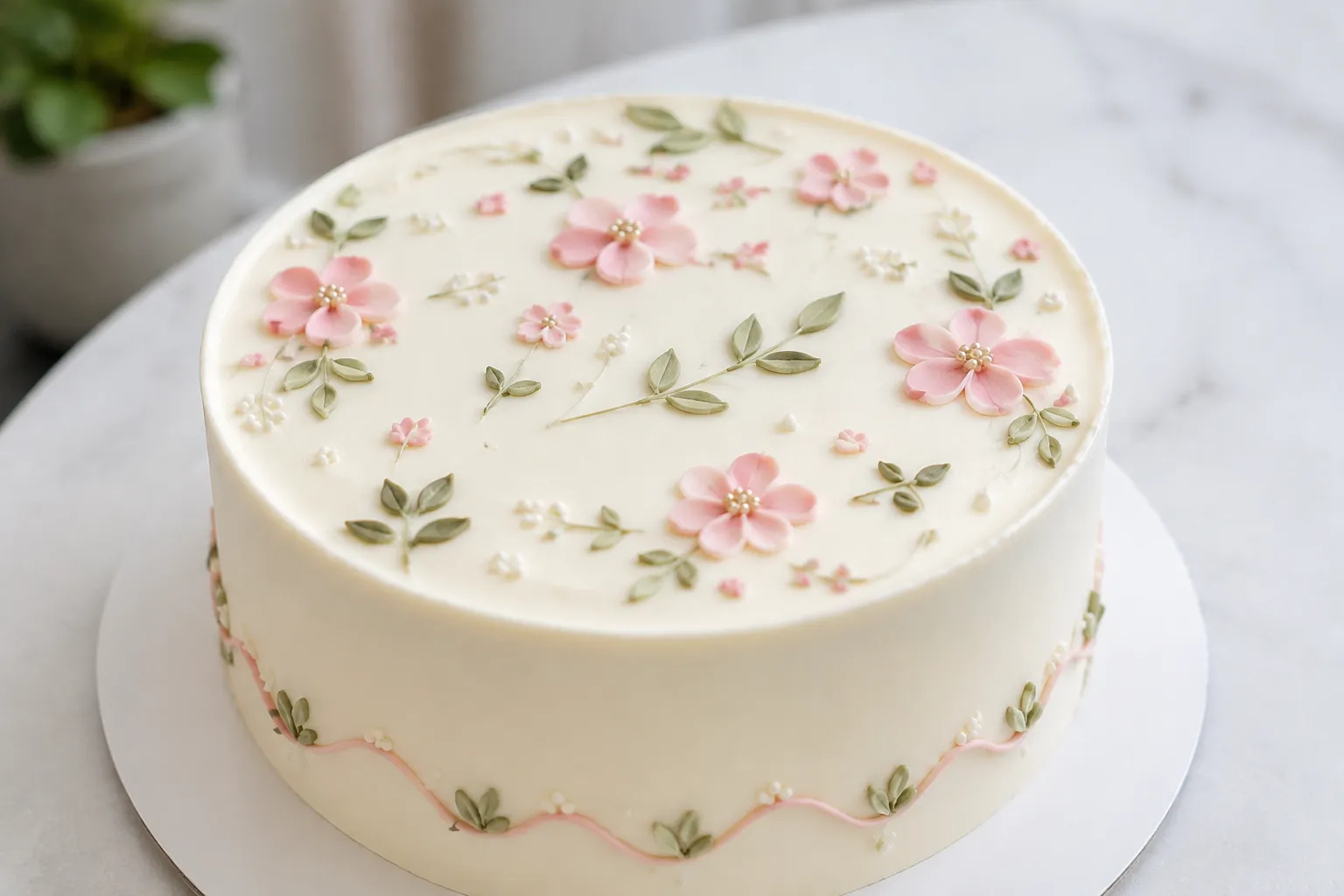
Surface texture also changes the role of decoration. A heavily marked exterior may already provide visual activity, while a smooth finish leaves more space for lettering, piping, or one focal detail.
Translate loose terms into observable specifications:
- Smooth or visibly marked.
- Matte or reflective in the reference.
- Fine or coarse texture.
- Continuous or interrupted surface.
- Clean, soft, sharp, or irregular edge.
- Even texture or varied texture.
- Texture across the full cake or only selected areas.
"Rustic," for example, could mean a lightly uneven coating, visible strokes, rough edges, natural-looking spacing, or several of these details together. Ask the bakery to convert the adjective into a sample finish, sketch, or written description.
Research on cake formulation shows that visible properties such as volume, texture, moisture-related behavior, and color can depend on the formulation and process. That makes the appearance of a reference insufficient evidence for the recipe, coating, or handling method behind it. Keep those details open for producer confirmation.
Decorations and Placement
Decoration placement is more than a list of objects. It is the arrangement of focal, supporting, and repeated elements across the cake.
- Type: floral detail, lettering, figure, pattern, fruit-like form, geometric piece, or another motif.
- Position: top, side, base, tier junction, center, edge, or scattered across the surface.
- Scale: dominant, medium, small, or repeated.
- Density: sparse, moderate, or concentrated.
- Direction: vertical, horizontal, diagonal, radial, or irregular.
- Relationship: attached to the surface, clustered around a focal point, or separated by open space.
A useful placement note might read: "Keep the lower tier mostly open. Place one medium focal detail on the upper right, with three smaller elements moving diagonally toward the base."
Spacing deserves its own line. Two cakes can use the same motif but look very different because one has generous gaps and the other fills the surface. Piping density, repeated marks, and distance between tiers affect the visual rhythm.
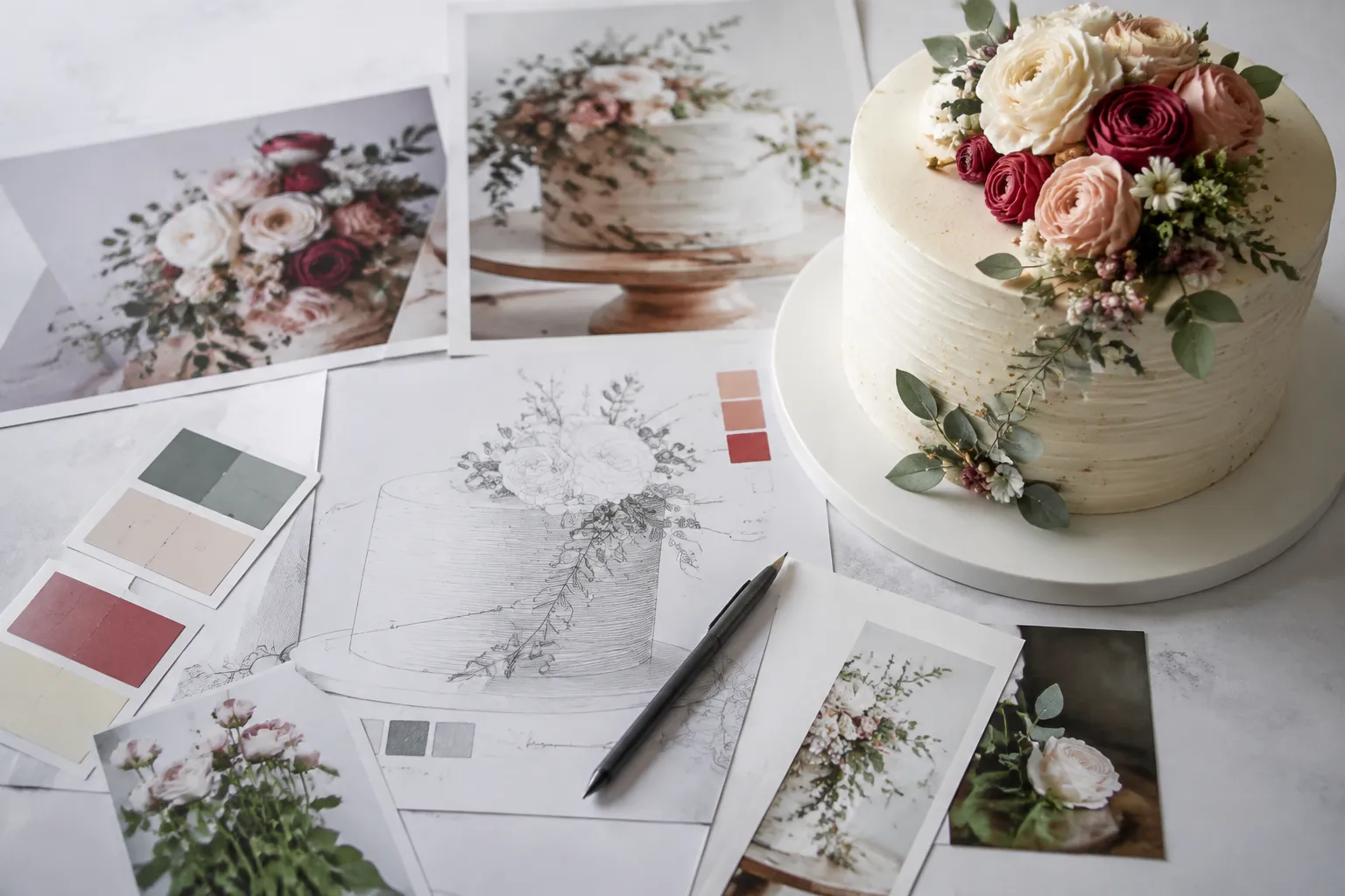
When using several references, label the contribution of each one: preferred silhouette, preferred surface, preferred decoration, or preferred color and lettering. A collage can communicate selected details efficiently, but it may leave the whole-cake composition unresolved. Pair it with a whole-cake sketch when the relationship between those details matters.
Theme Translation and Personalization
A theme does not need to appear as a literal image across the entire cake. It can enter through form, color, pattern, lettering, texture, scale, or one carefully selected symbol.
| Level of translation | Possible design evidence |
|---|---|
| Direct | Recognizable figures, objects, logos, characters, or printed motifs. |
| Moderate | Selected colors, repeated patterns, lettering, or simplified symbols. |
| Subtle | A profile, surface treatment, line direction, or restrained detail associated with the event. |
Separate the theme from the design evidence you want to retain. For example:
- Theme: a coastal evening celebration.
- Form: low and wide.
- Surface: soft horizontal texture.
- Color: deep blue with a pale accent.
- Focal detail: one small shell-like motif.
- Tone: restrained rather than literal.
This keeps the brief from becoming a collection of unrelated images. Venue images, invitation graphics, table colors, and event patterns may help establish visual context, but they do not establish venue rules, access conditions, or handling requirements.
Color and Visual Focal Points
Discuss color as a system rather than a single swatch. Identify the main surface color, secondary color, accent, lettering color, decoration color, and strongest contrast. Then name the visual focal point: lettering, a top decoration, a tier junction, a contrasting edge, or a pattern on one side.
A brief can state: "Use a pale neutral base, one muted accent, and a darker focal detail. Keep the strongest contrast near the lettering rather than the top decoration."
Terms such as "dusty," "bright," "soft," "deep," and "neutral" can vary between people and viewing conditions. Provide a named reference, swatch, sample, or comparison image where color matters. A preview can show a color relationship without reproducing the final surface, lighting, finish, or material appearance.
Build a Practical Cake Design Brief
A first handoff does not need to settle every production detail. It needs to make the visual priorities and remaining questions easy to identify.
- Occasion and setting.
State the event, display position, approximate viewing distance, and surrounding visual context. Include venue or table references only when they affect scale or color.
- Primary focal point.
Name what should be noticed first, which details support it, and which areas should remain quiet. Useful labels include primary focal point, supporting detail, repeated detail, open area, tier transition, and detail to omit.
- Form.
Describe the silhouette, number of visible tiers, overall profile, tier ratio, edge shape, and spacing. Explain whether an unusual outline is essential or simply one possible interpretation.
- Surface.
Specify the finish, texture direction, edge treatment, sheen, and how much of the cake should carry the texture.
- Decoration placement.
Mark the location, scale, density, direction, and relationship of each major decoration. Pair annotated images with words because an image may hide scale and depth.
- Theme and color hierarchy.
State whether the theme is direct, moderate, or subtle. Name the base, secondary, accent, lettering, and strongest contrast.
- Open questions.
Separate design preferences from questions about feasibility, ingredients, allergens, texture, handling, storage, transport, serving quantity, price, timing, venue requirements, and decoration materials.
Compare Cake Design Options on the Same Criteria
Comparing cake design options works best when every option is considered against the same questions: profile, tier ratio, finish, decoration density, color, scale, focal point, and unresolved constraints.
| Comparison | What changes visually | What the choice depends on |
|---|---|---|
| Tall profile versus low profile | Tall profiles emphasize vertical movement; low profiles create more horizontal presence. | The intended size, tier relationship, decoration scale, and producing bakery's assessment. |
| Smooth finish versus textured finish | A smooth surface creates a quieter field; texture adds movement and may become the main feature. | Whether the surface or decoration should carry the visual emphasis. |
| Concentrated versus distributed decoration | Concentration creates a clearer focal area; distribution creates a more even rhythm. | The desired hierarchy and how the arrangement should continue around the cake. |
| Literal versus indirect theme | Literal references are easier to recognize from one image; indirect references rely more on context. | Whether the theme's role is recognition, personal meaning, color coordination, or a restrained association. |
| One dominant color versus restrained palette | A dominant color can unify the cake; a contrasting accent can direct attention. | Which colors are essential and which may be interpreted during production. |
Ask to see the full composition, including the least decorated side. A front view can hide how elements wrap around the cake or how the design reads from the table.
Review What the Preview Communicates
A preview is a communication tool. It may include photographs, collages, sketches, digital renderings, sample surfaces, color references, or a whole-cake view. Each format answers different questions.
- Reference photographs show examples of finish, decoration, or proportion.
- Collages show which elements you want to combine.
- Sketches show placement, outline, and composition.
- Digital renderings show a proposed whole-cake arrangement.
- Samples and color references help narrow finish and color language.
- Venue images show surrounding context and approximate visual scale.
No single preview necessarily communicates every detail. A collage may show attractive individual elements without showing how they work together. A sketch may show placement but not texture. A digital image may suggest color and shape while leaving dimensions, materials, and production method unresolved.
Review the proposed design from the front, back, side, and top when relevant. Also consider the full cake at display distance, the focal detail at close range, the relationship between tiers, and the relationship between cake and surrounding table or venue.
Write down what the preview confirms visually and what still needs a decision. Research on customized-cake communication similarly treats references, sketches, and shared visualization as tools for discussing a design, rather than as evidence that every final detail has already been settled.
Scale, Spacing, and Common Brief Problems
Scale affects whether a design reads as a focal detail, a repeated pattern, or visual noise. Describe it in relation to the cake when exact dimensions are not yet known.
- One large detail versus several small details.
- Fine piping versus broad piping.
- Narrow lettering versus lettering intended to read from a distance.
- Small gaps between repeated motifs versus generous open space.
- Detail concentrated at one tier versus distributed across all tiers.
Several recurring brief problems are easy to correct:
- Mixed references without hierarchy: identify which features are essential and which are optional.
- Adjectives without visual definitions: replace "elegant" or "natural" with details about edge, finish, contrast, density, scale, and placement.
- A generated concept treated as a finished example: use it to explore direction while keeping materials, dimensions, and production method open.
- Only a front view: specify how the design should continue around the sides and back.
- No focal point: name the feature that should receive the strongest emphasis.
Appearance alone does not establish taste, ingredients, allergens, serving quantity, price, availability, storage, transport performance, structural stability, or venue acceptance. Keep those matters in the confirmation section of the brief.
Short Cake Design Brief Template
- Occasion and setting
- Describe the event, display context, and relevant surrounding colors or patterns.
- Overall direction
- Use three to five observable terms, such as tall profile, smooth finish, sparse piping, warm neutral palette, or concentrated floral detail.
- Silhouette and tier ratio
- Describe the outer shape, number of tiers, relative widths, height, and visible spacing.
- Surface and edge
- State the intended finish, texture, sheen, and edge treatment.
- Decoration and placement
- List focal, supporting, and repeated elements, including position, direction, scale, and density.
- Theme translation
- Explain whether the theme should be direct, moderate, or subtle.
- Color hierarchy
- Name the base, secondary, accent, lettering, and strongest contrast.
- Open questions
- List the details that require confirmation from the producing bakery or venue.
- Preview request
- Ask which views, samples, measurements, or written details are needed before the design is treated as agreed.
Choose the Next Route
Choose the topic that matches the decision currently blocking the brief:
- Silhouettes and tier proportions: when the profile, outline, or tier relationship is unsettled.
- Finishes and surface textures: when the exterior surface carries most of the visual direction.
- Decorations and placement: when the main issue is focal detail, piping density, scale, or arrangement.
- Theme translation and personalization: when an event or personal reference needs a coherent visual language.
- Color and visual focal points: when the palette, contrast, or hierarchy is unclear.
The root decision is not which cake is universally best. It is which visual direction can be described clearly enough for the producing bakery to assess, adapt, and confirm.
Questions Before Production
- Which parts of the reference can be treated as visual direction?
- Which parts require a new sketch, sample, or whole-cake preview?
- What may differ between the reference image and the proposed cake?
- Which color terms need a sample or more specific reference?
- How will the chosen profile and tier ratio be recorded?
- Which decorations are focal, and which can be simplified?
- How will the design appear from the back and sides?
- Which ingredients, allergens, textures, and fillings need confirmation?
- What storage, handling, transport, and venue conditions could affect the design?
- Which serving quantity, price, availability, and timing details remain to be established?
- Which decisions are fixed, and which remain subject to production feasibility?
A clear brief does not remove every unknown. It places each unknown with the person or organization responsible for confirming it.