
Cake Color and Visual Focal Points
A cake color palette becomes easier to use when every color has a visible role. The brief should show what acts as the base, what supports it, where the accent sits, and which detail should attract attention first.
The same colors can produce different results when their placement changes. A narrow lower-edge accent reads differently from a full tier surface, while a dark piping color creates another focal point when used as a broad drip.
This page compares those decisions so a preferred palette can become a clearer bakery conversation. It focuses on what a reference shows, what the arrangement suggests, and what still needs confirmation.
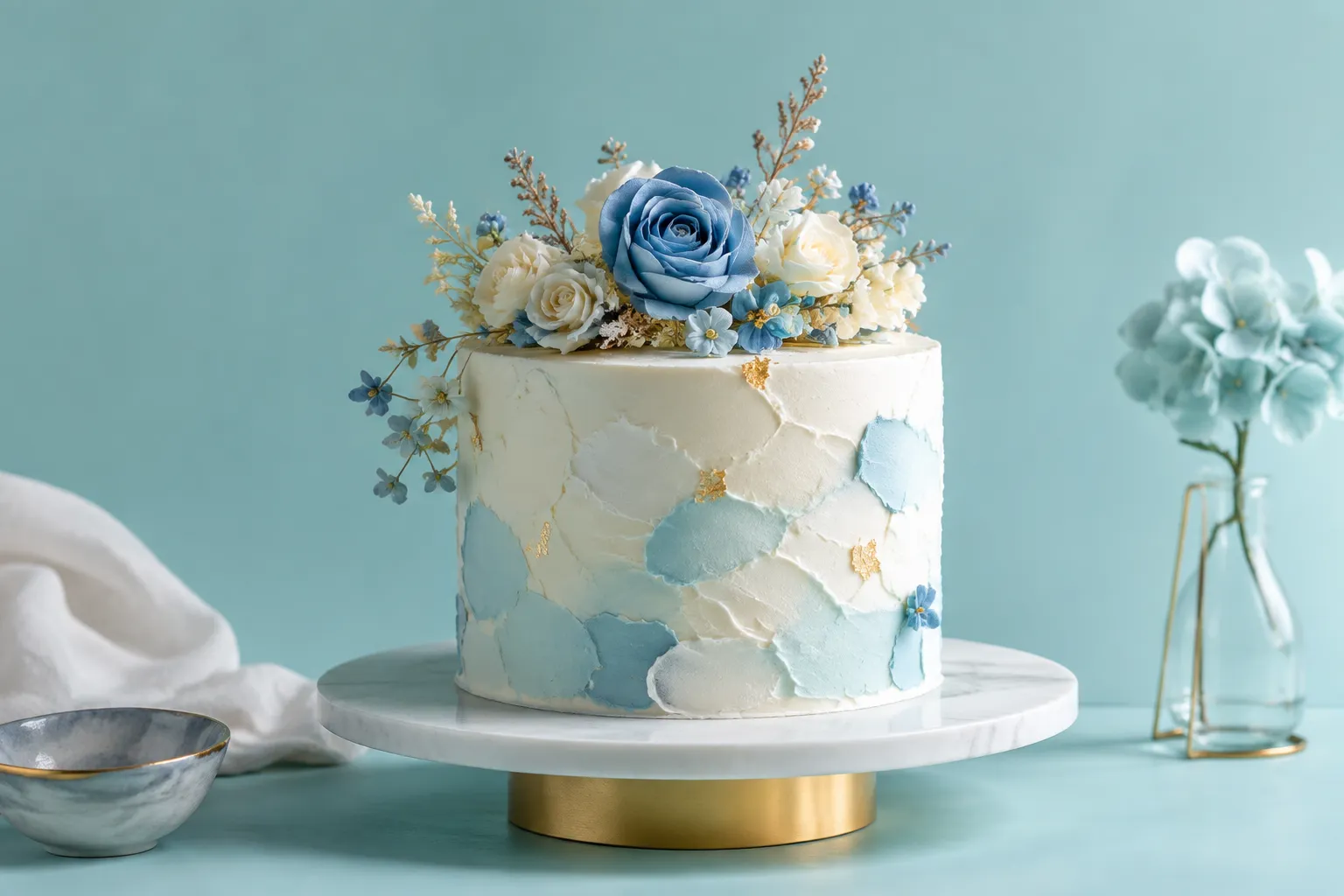
More specific pages
These pages continue the topic in smaller, more specific directions.
Start With the Role of Each Color
A palette names the colors. It does not show how much of each color appears or where each one belongs on a three-dimensional cake.
For a useful cake brief, assign each shade a role:
- Dominant color: the largest continuous surface or main background.
- Secondary color: a supporting tier, band, or larger decorative area.
- Accent color: a smaller area intended to attract attention or create contrast.
- Detail color: a shade repeated through piping, lettering, flowers, borders, or small marks.
- Neutral or base color: a surface that gives the other colors room to remain distinct.
“White, blue, and gold” leaves several decisions open. “White base, pale blue on the middle tier, gold only on the upper edge and lettering” gives the producing bakery a visible structure to assess.
The distinction between palette and application matters. A palette board can show which colors sit together, while a cake preview must show how those colors are distributed across tiers, surfaces, and details. A combination that looks balanced in flat swatches may carry more visual weight when one shade covers an entire tier.
A Practical Palette Brief
Describe each color with four details:
- Color role: base, secondary, accent, or detail.
- Location: tier surface, top, edge, drip, piping, topper, or decoration.
- Approximate scale: narrow mark, small cluster, partial band, or broad surface.
- Repetition: used once, repeated on one tier, or echoed across the cake.
Use proportion as a comparison tool, not a formula. There is no supported cake-specific rule here that identifies an ideal accent percentage or universally preferred location.
Where to Place an Accent Color on a Cake
Accent placement changes the first area that receives attention and the relationship between the tiers. The most useful comparison keeps the cake silhouette and main finish stable while changing the accent location.
Accent on the Top
A color restricted to the topper, lettering, upper floral cluster, or top decoration keeps the main cake surface relatively quiet. The upper area becomes the focal point, while the silhouette remains largely defined by the base finish and tier ratio.
This route suits a brief such as:
- Keep the tiers mostly neutral.
- Use the accent only in the topper and upper decoration.
- Repeat the accent lightly in the top piping.
The open questions concern the size of the topper, the decoration material, the amount of edible detail, and whether the top element needs additional support. The reference image does not establish those details from appearance alone.
Accent on the Edge
A colored border, lower edge, piped line, or narrow band creates a horizontal marker. It can make tier boundaries more noticeable and direct attention toward the cake’s profile.
Compare two versions:
- Thin edge accent: the silhouette and surface finish remain prominent.
- Broad edge band: the color becomes a more substantial part of the tier.
The producing bakery needs to confirm how the edge is formed and which finish is achievable for the order. A sharp line communicates something different from a rounded, irregular, or textured border.
Accent as a Drip
A drip places color along the upper perimeter and down the side of a tier. Placement, length, spacing, edge control, and surface appearance therefore become one connected decision.
A reference may show evenly spaced drips, varied lengths, a narrow line near the edge, or a heavier band at the top. These details should be described separately in the brief because they change the visible rhythm.
Ask the bakery to confirm the intended material, application method, handling requirements, and the appearance they consider achievable. A photograph can communicate the direction without proving that the same finish, shade, or surface behavior will result.
Accent Across a Tier Surface
A full tier in the accent color creates a larger block of visual weight. It can separate one tier from another, but it may also compete with the cake’s main decoration.
This route is clearer when the brief specifies the color block:
- Place the accent on the middle tier only.
- Keep the top and bottom tiers in the base color.
- Avoid repeating the accent across every large surface.
Tier ratio matters because a short tier and a tall tier do not present the same visible area. Review the whole cake rather than isolated color samples.
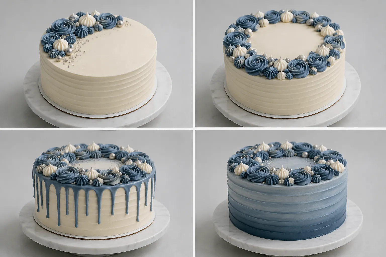
Dominant and Accent Color Proportion
Color proportion describes how much visible space each shade occupies across the complete cake, including decoration, piping, toppers, and borders.
A small accent can carry substantial visual weight when it contrasts strongly or sits on an important edge. A larger accent may appear more integrated when it is close in tone to the dominant surface. These are comparison observations, not guarantees about how every viewer will respond.
| Option | Visible arrangement | Planning consequence |
|---|---|---|
| Low accent proportion | One narrow band or small detail | Keeps the base finish prominent |
| Moderate accent proportion | Repeated piping, a partial tier, or several clusters | Creates stronger links between areas |
| High accent proportion | A full tier, broad drip, or large decorative field | Makes the accent part of the main profile |
| Distributed accent | Small amounts repeated across tiers | Creates rhythm and continuity |
| Concentrated accent | One main area with little repetition | Creates a clearer focal component |
The comparison becomes difficult when several variables change at once. If one version uses a different tier height, edge shape, piping density, and accent proportion, the color decision cannot be isolated.
Keep these features stable where possible:
- cake silhouette and number of tiers;
- approximate tier ratio;
- base finish and decorative category;
- viewing angle and visible cake surface;
- relative size of the topper or primary decoration.
Then change one decision family, such as accent location or accent scale.
Cake Color Visual Hierarchy: What Receives Attention First?
Visual hierarchy describes which areas appear most prominent within the composition. On a cake, contrast, scale, placement, edge definition, repetition, and nearby decoration can all change that order.
Research on cake decoration uses terms such as harmony, rhythm, symmetry, and proportion to describe decorative organization. Those terms can sharpen a review, but they do not establish a universal focal-point formula or required accent ratio.
Translate broad design language into visible questions:
- Is the accent isolated or repeated?
- Does it sit on the top, side, edge, or between tiers?
- Is it larger than the lettering or topper?
- Does piping repeat the same color often enough to compete with the main detail?
- Does the accent follow the silhouette or interrupt it?
- Are the spaces between repeated accents even, varied, or unclear?
- Does the finish make the color appear flat, reflective, textured, soft, or sharply defined?
A focal point is not only a color. It may be a topper, floral cluster, lettering, tier transition, drip, or contrasting edge. Color can support that component, compete with it, or redirect attention elsewhere.
Accent Color Scale on Cake
Scale describes the visible size of the accent relative to the cake and its other components.
Compare these instructions:
- “Use a little green.”
- “Use green only in the piping.”
- “Use green for the full middle-tier finish and repeat it in the flowers.”
The first describes a preference. The second assigns a detail role. The third assigns both a surface role and a repetition role.
A production-facing brief should identify whether the accent is:
- a fine line;
- a narrow border;
- a cluster of small marks;
- a medium decorative element;
- a partial surface;
- a complete tier; or
- a repeated component across the cake.
Scale also changes with viewing distance. A detail visible in a close photograph may carry less weight when the cake is viewed as a complete display. A useful preview includes both detail views and a full-cake view.
The image does not establish the finished texture, ingredient composition, exact shade, or handling requirements. Ask the bakery which visual features can be represented reliably and which will remain approximate.

Spacing Between Cake Colors
Spacing affects whether colors appear connected or separate. Repeated accents placed close together can read as one larger group, while the same marks separated by the base color may appear more distinct.
Within One Detail
Review the distance between piped marks, flowers, letters, or small colored elements. Dense repetition can make an accent read as a surface treatment rather than an isolated point.
Between Details on One Tier
A cluster on one side creates a different balance from a continuous band around the tier. The reference should show whether the decoration wraps around the cake or appears only from one viewing angle.
Between Tiers
Repeating the accent on every tier creates continuity through the cake’s structure. Restricting it to one tier creates separation and gives that tier greater visual importance.
Ask whether the arrangement should remain consistent around all visible sides. A front-facing photograph may conceal how the accent is distributed around the full circumference.
Color Placement Across Cake Tiers
Each tier can carry a different role, but the arrangement should be described as a relationship rather than a list of isolated colors.
One Accent Tier
One tier carries the main color block while the others remain in the base or secondary color. This creates a clear area of emphasis and makes tier ratio especially relevant.
Alternating Tiers
The accent and base colors alternate vertically. Repetition becomes part of the cake’s structure, although the arrangement may look more divided than a single-accent option.
Gradient-Like Progression
Several related shades move from one tier to another. The preview should show whether the differences remain visible under the proposed finish and lighting. Nearby shades do not guarantee that every transition will be perceptible.
Shared Details Across Tiers
The tiers remain mostly consistent while one accent repeats through borders, piping, lettering, or small decorative groups. This can connect the composition without covering large surfaces.
For every tier plan, specify which tier receives the strongest color area, whether the accent continues around the full tier, how the tiers differ in height and width, and which component should remain the primary focal detail.
Cake Edge Shape and Color
The edge marks a visual boundary between surfaces. Its shape can make a color appear crisp, soft, raised, irregular, or integrated into the finish.
Describe the edge rather than relying on broad adjectives:
- straight piped line;
- rounded border;
- sharp tier transition;
- textured ridge;
- soft brush-like mark;
- irregular drip;
- clean band; or
- undecorated edge.
The same accent color will not communicate in the same way through each treatment. A thin piped line repeats a narrow signal, while a broad textured edge becomes a larger component. A drip changes both the top perimeter and the vertical surface.
The producing bakery must confirm the material, tools, surface preparation, and handling needed for the selected treatment. Appearance alone cannot establish structural stability, food-contact suitability, or storage and transport performance.
Cake Finish and Color
Finish affects how a color is seen. A smooth surface, textured coating, reflective detail, matte-looking area, or rougher treatment can change the shade’s relationship with surrounding details.
Label a reference according to what it actually is:
- Photographed finished cake: shows a completed object in a particular setting.
- Documented method: supports a description of a recorded decoration process within its stated limits.
- Illustrative example: communicates an arrangement or material direction.
- Generated or non-final preview: communicates an intended composition without establishing final production.
For a bakery brief, separate color from finish:
Base color: muted blue.
Surface: smooth-looking, with no visible texture in the reference.
Accent: warm metallic-looking detail on the upper edge.
Confirmation needed: achievable finish, material, application, and final appearance under the planned lighting.
Do not infer flavor, ingredients, allergen status, or colorant type from a visible shade. Those are order-specific questions for the producing bakery.
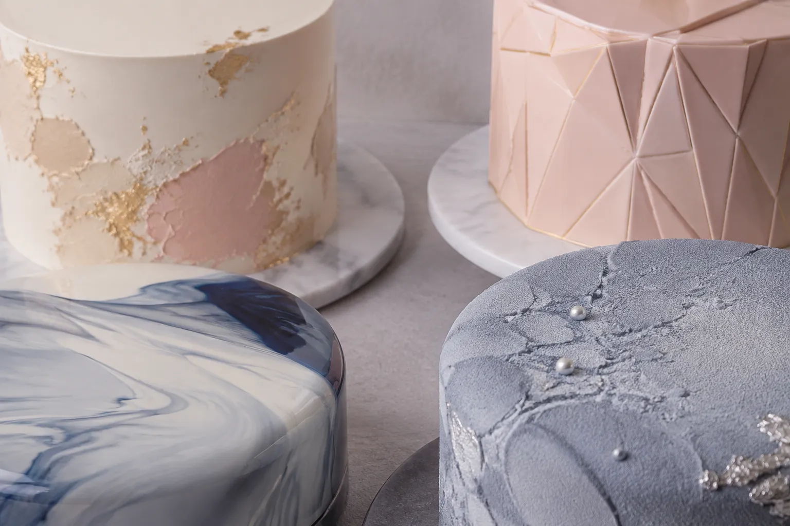
Piping Density and Color Repetition
Piping changes both color proportion and surface rhythm. A color used in one inscription may remain a focal detail, while the same color repeated through borders, shells, rosettes, dots, and lettering can become a dominant pattern.
- Single focal piping: one concentrated detail with limited repetition.
- Border repetition: the accent defines tier edges or transitions.
- Scattered piping: small marks distribute the color across a surface.
- Dense piping: the accent occupies enough area to read as a major finish.
“Add more detail” is difficult to assess consistently. Specify density, placement, and repetition instead:
- Use a single border around the upper tier.
- Repeat small accents at three points on the front-facing side.
- Keep the lettering darker than the surrounding piping.
- Avoid filling the full edge with repeated motifs.
A full-cake preview is necessary because close-up decoration can look balanced while the complete silhouette becomes crowded.
Comparing Cake Color Options
A useful comparison keeps the criteria constant and changes one main decision at a time.
Option A: Quiet Base With One Concentrated Accent
Shows: a dominant base surface and one clear focal detail.
Supports: a brief where lettering, a topper, or a floral detail carries the emphasis.
Needs confirmation: the focal detail’s size, material, and relationship with the base finish.
Option B: Repeated Accent Across Tiers
Shows: the same color in borders, piping, or small clusters at several levels.
Supports: a connected composition with visible rhythm.
Needs confirmation: spacing around the full cake and whether repetition competes with the main decoration.
Option C: Accent as a Tier or Broad Surface
Shows: a larger block of color that changes the cake’s profile.
Supports: stronger separation between tiers or a more graphic arrangement.
Needs confirmation: finish, color application, tier ratio, and appearance across the complete surface.
Option D: Accent Concentrated at the Edge or Drip
Shows: a color following the perimeter and extending down the side.
Supports: a clear boundary between top and side surfaces.
Needs confirmation: edge control, material consistency, application method, and handling requirements.
Choose the path by identifying the decision that matters most. A visible topper calls for limited competing accents. Tier-to-tier rhythm calls for deliberate repetition. A strong color block requires the scale and surface finish to be reviewed together.
Build a Cake Palette Design Brief
A concise handoff can separate visual preferences from production questions:
Palette
- Base color:
- Secondary color:
- Accent color:
- Detail color:
Placement
- Main accent location:
- Secondary repetition:
- Areas that should remain neutral:
- Whether the accent wraps around each tier:
Proportion
- Small detail, narrow band, partial surface, or full tier:
- Color intended to occupy the largest visible area:
- Component that should remain the focal point:
Form
- Silhouette:
- Tier ratio:
- Edge shape:
- Piping density:
- Surface finish:
Reference Limits
- What the image shows:
- What the image leaves open:
- Which parts are illustrative or non-final:
Bakery Confirmation
- Ingredients and colorants:
- Allergens and food-contact materials:
- Finish and decoration method:
- Structural and handling requirements:
- Storage and transport:
- Serving information:
- Price and availability:
- Venue requirements:
This format gives the bakery a clearer basis for identifying conflicts, revisions, or details that cannot be confirmed from a reference image.
When a Reference Image Is Not Enough
Reference images compress several decisions into one visual surface. A photograph may show the silhouette while hiding the back of the cake. A collage may combine the finish from one cake with the tier arrangement from another. A sketch may show placement without showing texture or material.
Research on customized-cake communication describes different strengths for detail-focused collages and whole-form sketches. Collages can communicate surface details efficiently but may not show how those details work together. Sketches can show spatial composition while leaving texture and color behavior open.
Use more than one view when the decision depends on:
- full-cake proportion;
- color placement around all sides;
- the relationship between tiers;
- edge treatment;
- piping density; or
- the relative scale of the topper and decoration.
A generated or non-final reference can help compare arrangements, but it should be labeled clearly. It does not establish exact color matching, ingredients, stability, serving yield, price, availability, delivery performance, or venue acceptance.
Final Review Before the Bakery Handoff
- Palette roles: Is every color assigned a role?
- Accent location: Is the main placement explicit?
- Visible proportion: Is the accent a detail, band, partial area, or full surface?
- Focal point: Which component should receive the strongest attention?
- Repetition: Does the accent appear once, on one tier, or throughout the cake?
- Spacing: Are the gaps between repeated details intentional?
- Tier relationship: Does the color arrangement support the selected tier ratio?
- Edge and finish: Are the shape and surface treatment described separately?
- Reference limits: Is it clear what the image shows and leaves open?
- Confirmation list: Are feasibility, handling, ingredient, serving, price, availability, and venue questions directed to the responsible bakery or venue?
A strong cake color palette brief makes the visual decision legible. It distinguishes a narrow accent from a broad color field, a focal detail from repeated piping, and a complete cake view from an isolated reference image.
Mark the visible choice on the brief, then leave material, handling, structure, and order-specific details for confirmation with the producing bakery.
Sources
- Representation of aesthetic categories in cake decoration
- 360 Degrees of Feminine Competence: Surface Aesthetics, Expertise, and Authority Among Drip Cake Baker-Influencers
- Design a socialVR tool for the remote co-design of customized cakes
- Palette, Purpose, Prototype: The Three Ps of Color Design and How Designers Navigate Them
- De-Stijl: Facilitating Graphics Design with Interactive 2D Color Palette Recommendation