
Theme Translation and Personalization
The first decision for themed cakes is how directly the cake should state its reference. Decoration methods come later, because the intended recognition level changes the scale, placement, and density of almost every visible detail.
A literal direction uses a character, logo, photograph, object, phrase, or explicit motif. A subtle direction may carry the same reference through palette, silhouette, texture, pattern, restrained piping, or one focal detail. Neither path is inherently more personal; the useful choice depends on who should recognize the reference and how quickly it should read.
More specific pages
These pages continue the topic in smaller, more specific directions.
Literal vs Subtle Themed Cake Design
Literal and subtle are positions on a spectrum rather than fixed categories. A large monochrome silhouette can read literally, while a dense abstract pattern may remain subtle in meaning despite its visual weight.
| Decision | Literal path | Subtle path |
|---|---|---|
| Recognition | Designed to be identified quickly | May depend on context or prior knowledge |
| Primary cues | Character, object, text, logo, image, or explicit motif | Palette, outline, texture, pattern, or small symbolic detail |
| Motif scale | Often medium or large | Often small, partial, or integrated into an edge |
| Surface coverage | May use repeated or broad decoration | Often preserves more open visual space |
| Color dependence | Shape or text may carry recognition | A particular color relationship may carry more weight |
| Focal placement | Usually prominent and direct | May be offset, edge-based, or visible at closer range |
| Simplification | Must preserve identifying features | Can reduce the reference to selected cues |
When the literal path fits
Literal themed cake design supports fast recognition. It may suit a subject that should remain clear in the full cake view, in photographs, or to guests who do not know the personal story.
Literal does not mean using every available detail. A crowded surface can weaken hierarchy when text, figures, patterns, and secondary motifs compete at the same scale.
A useful literal brief identifies:
- The element that must be recognized
- The intended audience
- Whether recognition depends on shape, color, text, or several cues
- The features that are essential
- The details that may be simplified
- The main placement and approximate coverage
Character, logo, photograph, book, and artwork requests may need an order-specific reproduction review. The bakery should state what it can produce and which alternatives remain available.
When the subtle path fits
Subtle themed cake design reduces the number or prominence of explicit motifs. One dominant color, a controlled accent, an abstract pattern, edge-only piping, or a small silhouette can carry the reference without taking over the full profile.
“Keep it understated” is too broad for a handoff. It leaves open whether restraint means lower contrast, smaller motifs, lighter piping, wider spacing, reduced coverage, or several of these choices together.
- Use one dominant color with limited accents
- Choose a small motif instead of a full figure or object
- Keep piping at the edge rather than across the surface
- Use fine lines and open spacing
- Retain one focal placement instead of repeating motifs on every side
- Preserve the silhouette while reducing internal detail
The main tradeoff is recognition. A restrained reference may work for the recipient while remaining ambiguous to other guests, so the brief should state whether that ambiguity is acceptable.
Decide How Quickly the Theme Should Read
Recognition speed converts an imprecise style preference into a review criterion. It also reveals which cue must carry the theme when smaller details disappear at viewing distance.
- Immediate: The subject should be identifiable from the overall cake view.
- Contextual: The reference should become clear beside the event setting or related details.
- Personal: The detail mainly needs to be understood by the recipient or a defined group.
An immediate reading usually needs a strong cue, such as a large silhouette, legible wording, a distinct object, or a familiar color arrangement. A personal reading can rely on a smaller flower, invitation pattern, private symbol, or restrained color reference.
These levels describe intent, not a predicted audience response. Recognition still varies with familiarity, context, culture, viewing distance, and the selected details.
Translate Personal References Into Visible Choices
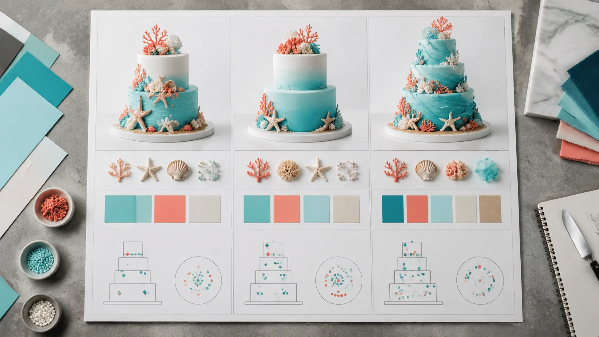
Personalized themed cakes often begin with a photograph, hobby, flower, book, sport, memory, invitation pattern, or seasonal reference. The working task is selection rather than automatic reproduction.
Subject and identifying cues
Name the specific subject, then list the smallest set of cues needed to retain it. These may include a distinctive outline, two defining colors, a repeated pattern, initials, one object, or a particular surface treatment.
Mark each cue as essential or flexible. If the design must be simplified, this distinction tells the bakery which details should retain priority.
Translation level
The same object could appear as a modeled focal detail, flat image, line drawing, silhouette, repeated pattern, or color source. Each version changes recognition speed, coverage, and the production questions attached to the brief.
Placement and scale
“Small detail” is incomplete without a position or proportion. State whether it belongs at the top center, upper front, lower edge, on one tier, or only on the presentation side.
An annotated sketch can clarify placement and tier ratio. It remains a briefing aid and does not establish final dimensions, material, or finish.
Acceptable simplification
Record what may change without losing the reference: internal lines, color count, motif repetition, wording, or the shift from a detailed image to a silhouette. Otherwise, the bakery cannot tell whether likeness, palette, texture, or overall profile carries the priority.
Turn Style Words Into Cake Details
Minimalist, elegant, playful, modern, personal, and meaningful can start a conversation, but they are not production specifications. Their meanings differ by person and setting, so each label needs an observable interpretation.
| Style word | Possible visible interpretation |
|---|---|
| Minimalist | Fewer colors, one focal detail, open spacing, low motif count |
| Elegant | Controlled contrast, fine line weight, restrained piping, defined edges |
| Playful | Stronger contrast, varied scale, repeated shapes, denser placement |
| Modern | Clear geometry, limited pattern types, deliberate asymmetry |
| Personal | Initials, a specific flower, a familiar pattern, or a private symbol |
| Meaningful | One selected reference given clear focal priority |
These are possible briefing choices, not universal definitions. The reference board should show which interpretation applies, without using age or occasion as a substitute for the recipient's stated preferences.
Control Color, Placement, Texture, and Pattern
Give each color a role
A themed cake color palette is easier to review when it has a hierarchy. Record a dominant color, one or more supporting colors, limited accents, and any neutral background area.
Color meanings are personal and contextual rather than fixed. A reference can show the intended relationship between colors, while the bakery still needs to explain how color expectations will be recorded and reviewed.
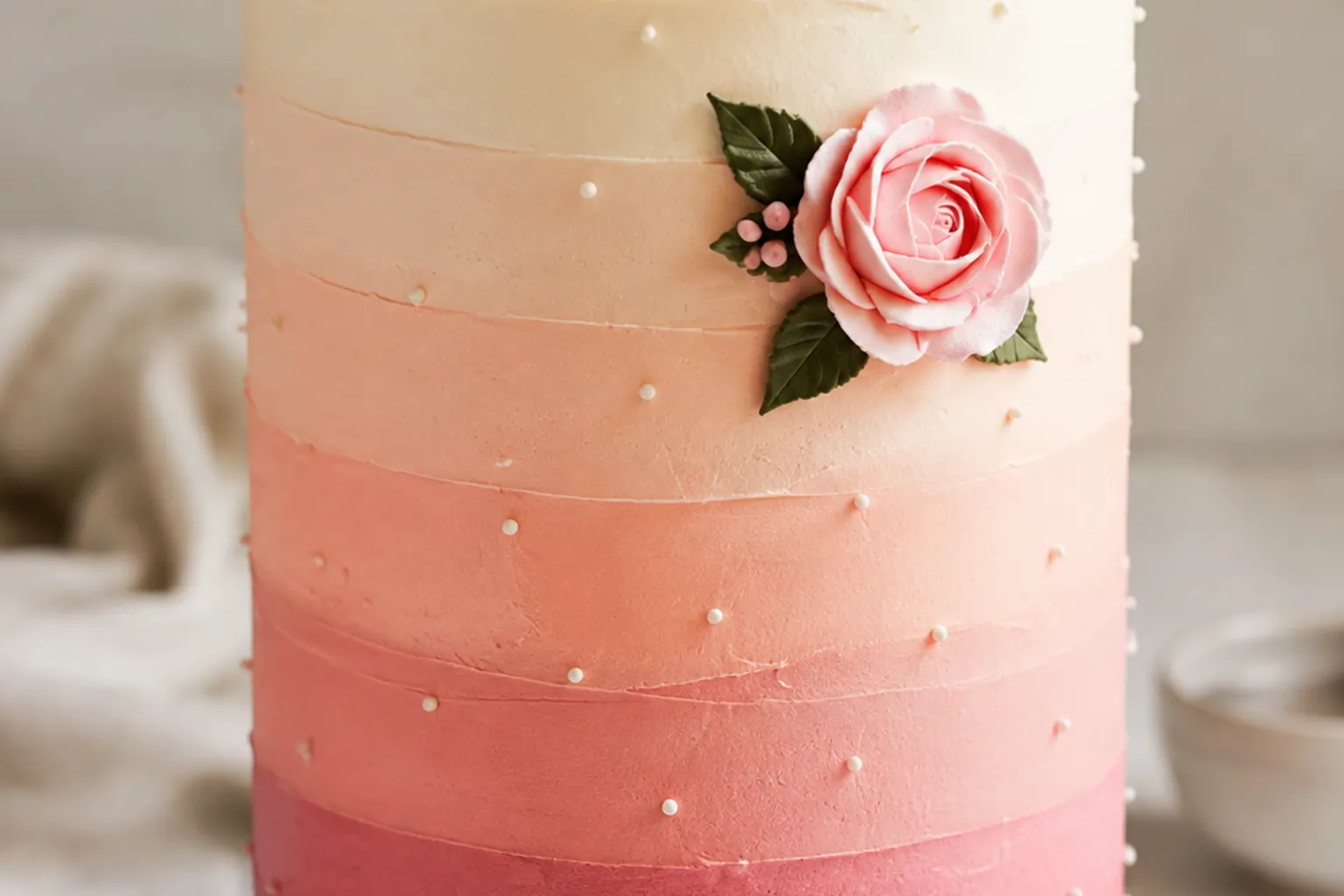
For an ombre finish, specify the color order, transition direction, approximate band placement, and whether the change should appear blended or visibly divided. Also mark whether the surface should read as smooth or textured.
Compare the same motif through four variables
- Coverage: Edge, panel, single tier, or full surface
- Density: Isolated, evenly repeated, clustered, or continuous
- Scale: Fine, small, medium, or dominant
- Hierarchy: Background texture, supporting motif, or focal detail
One small shape at the base may act as a private reference. Repeating it across every tier makes it visually dominant, while enlarging it into a front-facing focal detail increases recognition again.
Manufacturer tutorials document visible buttercream differences such as dots, shells, swirls, flowers, borders, and grass-like surfaces. Fondant demonstrations show bands, pleats, ruching, overlap, seams, and repeated spacing. These sources help describe line weight, density, folds, and coverage; suitability still depends on the bakery's materials and workflow.
Use Themed Cake Reference Photos Precisely
Every image on a reference board needs an assigned purpose. Without annotation, the bakery cannot know whether a customer is pointing to color, silhouette, texture, edge profile, placement, or the entire cake.
- Use this palette hierarchy
- Use this tier ratio
- Use this piping density
- Use this motif scale
- Use this focal placement
- Avoid this surface coverage
- Do not reproduce this topper
- Texture reference only
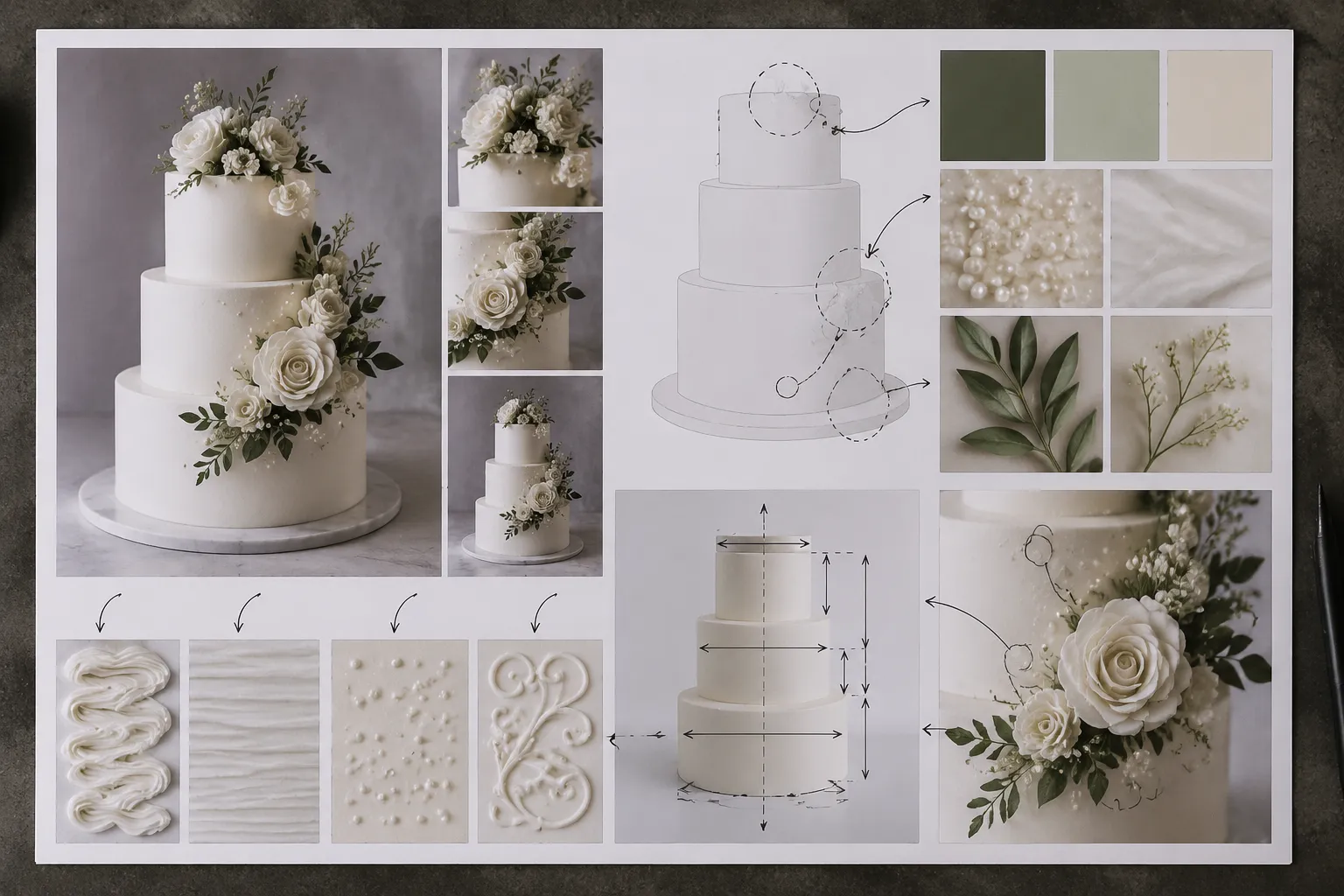
Multiple references can be combined when their instructions do not conflict. Taking the profile from one cake, the palette from another, and the border from a third is clearer than requesting a general merge.
- Photographed finished cake: Shows one completed appearance under particular photographic conditions.
- Documented tutorial: Shows a demonstrated method and visible result within that source's process.
- Annotated sketch: Communicates intended proportion, placement, and hierarchy.
- Generated or non-final preview: Supports comparison but does not document a completed cake.
- Confirmed production specification: Records details accepted for a particular order.
A collage may communicate texture while leaving the full composition unresolved. A sketch may clarify the profile while simplifying finish and color. Labeling each reference prevents those different roles from being mistaken for one complete specification.
Review the Preview as a Visual Decision
Review a preview for silhouette, tier ratio, palette hierarchy, motif scale, placement, spacing, finish direction, and focal priority. Then separate what has been resolved from what remains flexible or dependent on bakery confirmation.
Resolved visually
- Overall profile and literal, subtle, or mixed direction
- Dominant and accent colors
- Main motif and approximate coverage
- Focal placement
Flexible within the direction
- Minor spacing changes
- Small variation in handmade details
- Simplification of secondary motifs
- Distribution of repeated elements
Pending bakery confirmation
- Materials, ingredients, and decoration methods
- Reproduction limits and attachment methods
- Food-contact status and removal instructions
- Internal structure and servings
- Storage, transport, delivery, and venue conditions
- Price, schedule, availability, and approval points
Prepare the Themed Cake Design Brief
The handoff should be short enough to scan and detailed enough to assess against the next revision. Organize it around visible choices first, then list production questions separately.
- Theme and audience: Name the reference, occasion, recognition level, and intended audience.
- Direction: Mark literal, subtle, or mixed, then separate essential, flexible, and excluded motifs.
- Form: Record the profile, tier ratio if discussed, edge treatment, viewing side, and focal placement.
- Color and finish: Assign dominant, supporting, accent, and background colors, then describe contrast and surface treatment.
- Decoration allocation: Set motif scale, coverage, piping density, spacing, border treatment, and acceptable simplification.
- Reference status: Label finished photographs, detail images, sketches, tutorials, and generated or non-final previews.
- Open questions: List materials, reproduction limits, food contact, servings, structure, storage, transport, venue conditions, price, schedule, and revisions.
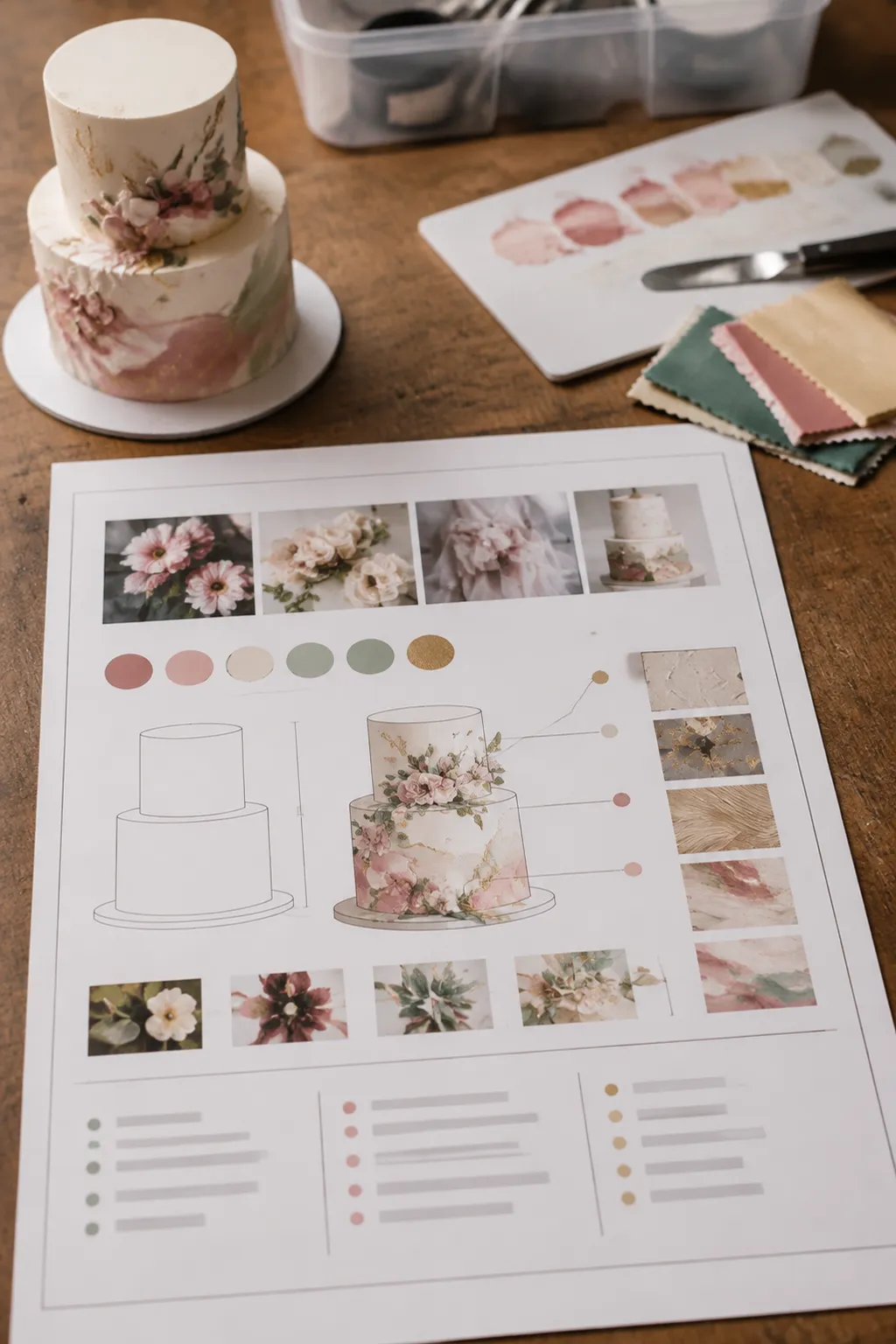
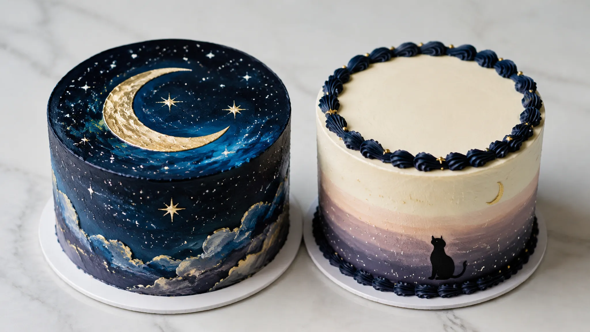
One theme can support two valid directions. A night-sky reference might use a large front-facing symbol over broad background coverage, or reduce that symbol to a small lower-edge silhouette supported by restrained piping. The decision is not detailed versus plain; it is which cue carries recognition and how much visual space that cue receives.
Check Decorations and Reproduction Limits
Decoration status cannot be inferred from appearance. Glitter, dust, pearls, flowers, toppers, wires, and printed pieces require product-level and order-level review.
FDA consumer guidance distinguishes products represented as edible from decorative products labeled only as non-toxic. Product labeling and the responsible bakery should establish whether an item is intended to be eaten, may contact the cake directly, or must be removed before cutting and serving.
- Is each decorative product intended to be eaten?
- May it contact the cake directly?
- Does it include a wire, pick, backing, support, or other attachment?
- Must it be removed before cutting or serving?
- What handling instructions need to reach the venue or person serving the cake?
A reference image documents an appearance, not another producer's commitment. Dimensions, materials, methods, color interpretation, handmade variation, schedule, and bakery workflow can all affect the result.
Finish the brief by marking the visible choice, the acceptable variation, and the next approval point. The reference settles the direction; the producing bakery must establish what the order can support.