
Literal vs Subtle Themed Cake Design
Choose a literal themed cake when the cake must identify the theme on its own. Choose a subtle themed cake when color, finish, pattern, or one restrained focal detail should coordinate with the wider setting.
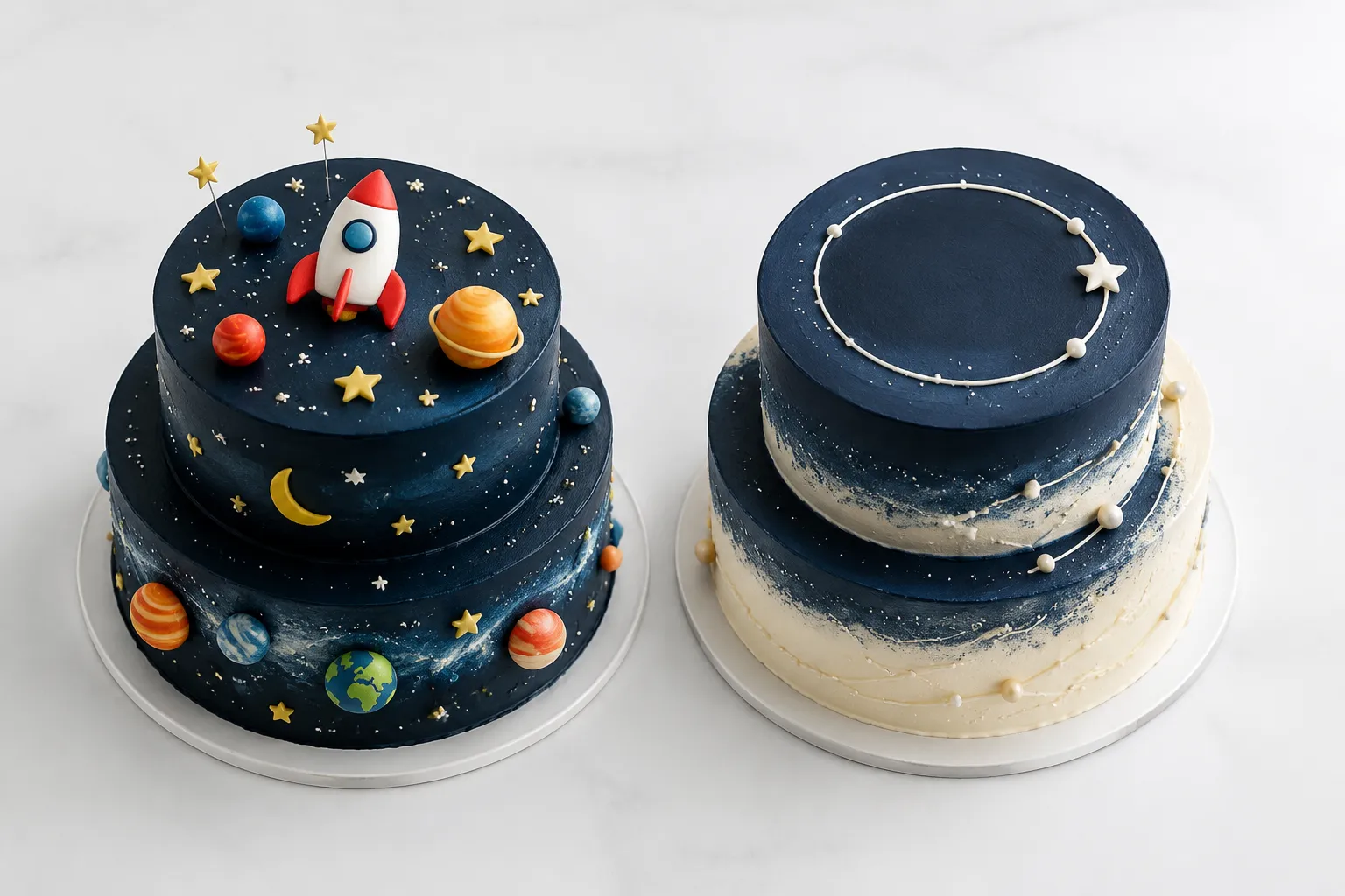
Neither direction is inherently stronger. The useful choice depends on how directly the cake must communicate, what the event already establishes, and what the producing bakery can execute within the order constraints.
These are planning terms, not standardized cake-design categories. They describe visible communication, not ingredients, structure, servings, transport performance, price, availability, or the final bakery commitment.
Literal vs Subtle Themed Cake at a Glance
| Design criterion | Literal treatment | Subtle treatment |
|---|---|---|
| Theme recognition | Immediate and specific | Indirect and contextual |
| Main cue | Character, object, symbol, scene, or lettering | Palette, pattern, finish, shape, or focal detail |
| Surface activity | Often concentrated around recognizable details | Usually controlled through spacing and repetition |
| Role of the setting | The cake can communicate independently | The cake may rely on flowers, stationery, or table styling |
| Brief priority | Name the symbols that must remain recognizable | Name the restrained cues that should carry the reference |
| Main unknown | How the direct reference will be interpreted and fabricated | Whether reduced cues will communicate clearly enough |
When Literal Treatment Fits
A literal treatment fits when recognition is the cake's primary visual task. The reference might show a sculpted object, character figure, repeated emblem, themed lettering, or a scene across several tiers.
Identify which symbols do the actual work. In a space-themed reference, a rocket and planets communicate the subject directly; a dark palette, star piping, and orbital lines support them.
If the brief needs simplification, preserve the identifying elements first. Also specify whether the theme should appear as one large focal detail or continue across the whole surface.
- Which symbols need to remain recognizable?
- Will the focal element be dimensional, flat, printed, piped, or supplied separately?
- Which reference details are required, and which are only directional?
- Will the motif continue around the cake or stay on the presentation side?
- Does the placement leave room for names, ages, or other lettering?
- Which visible materials need separate food-contact confirmation?
A photograph shows one finished appearance. It does not establish how another bakery will interpret the same object, material, scale, or detail level.
When Subtle Treatment Fits
A subtle themed cake fits when coordination matters more than immediate identification. It may borrow the theme's colors, geometry, surface character, or rhythm while leaving direct symbols to the surrounding event.
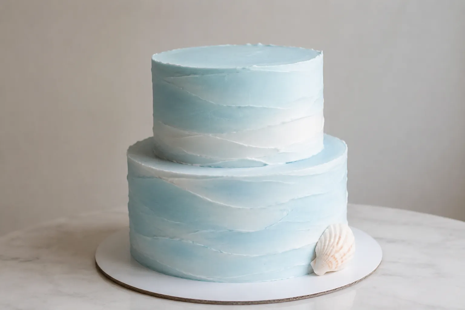
For an ocean theme, a literal cake might depict shells, fish, waves, or a boat. A subtle version could use pale blue and white, irregular horizontal texture, open spacing, and one restrained shell-shaped detail.
“Subtle ocean cake” is still too open for production. Translate the preference into visible instructions:
- Palette: two muted blues, white, and one small neutral or metallic accent
- Finish: softly textured rather than smooth or highly reflective
- Edge: clean top edges or deliberately irregular wave-like movement
- Piping: sparse, with open areas left visible
- Placement: detail concentrated near one lower edge rather than scattered evenly
- Focal detail: one shell, crest, or abstract wave form
- Contrast: low across most surfaces and stronger at the focal point
Restrained cues still need a hierarchy. If the palette and texture could suit several unrelated themes, decide whether the event context is expected to supply the missing recognition.
Ask which cue will remain dominant after revisions. Removing the only recognizable motif may leave a coordinated cake with no clear thematic reference.
Compare the Same Visible Details
Keep the cake profile constant when comparing literal and subtle treatments. Changes in tier count, proportion, or scale can otherwise distract from how the theme itself is expressed.
Silhouette and tier ratio
A literal design may use the silhouette as part of the depiction. A subtle version can retain a conventional profile and carry the theme through surface treatment. Record the tier count, relative dimensions, and whether the profile should appear compact or elongated.
Color and finish
Literal designs may retain several source colors because those colors identify a character or symbol. Subtle designs often reduce the palette and use contrast selectively. Name the dominant color, each accent, and where those accents belong.
CakeVR: A Social Virtual Reality Tool for Co-designing Cakes discusses communication difficulties caused by subjective color descriptions in customized-cake planning. A palette reference is more useful when paired with placement instructions.
Assign finishes by area rather than naming one treatment for the whole cake. The base surface, border, lettering, and focal element may each require a different finish.
Piping, spacing, and edges
“Detailed” does not indicate how much surface should be occupied. State whether piping covers a tier, forms a narrow border, clusters around one feature, or appears as isolated accents.
For a subtle treatment, open surface can be as important as the motif. Specify whether details should be symmetrical, evenly repeated, or deliberately clustered, then name the intended top and base edge treatment.
Focal detail and placement
Identify the primary detail, its size relative to the tier, and its viewing side. Useful placement language includes “centered on the front,” “offset to the lower left,” or “repeated around the full circumference.”
A Worked Brief Revision
An initial request might read:
Two-tier forest-themed cake, elegant and subtle, with green details and a little woodland decoration.
The theme is identifiable, but the instructions are not. “Elegant,” “subtle,” “green,” and “a little” could produce materially different previews.
Subtle version
Use two tiers, with a taller lower tier and narrower upper tier. Choose muted green, off-white, and one dark neutral. Keep the base lightly textured, with clean top edges and no full-surface scene. Concentrate fine foliage near the lower-left tier transition, leaving most of the front open. Add one small woodland focal detail, without character figures or repeated animal motifs.
Literal version
Keep the same two-tier profile and muted palette. Place two recognizable woodland figures on the front of the lower tier. Continue small tree and leaf motifs around both tiers, while keeping the top clear except for the name topper. Ask the bakery to specify the proposed scale and material of each figure.
Both revisions retain the forest theme. They differ in directness, motif count, surface density, and placement.
Read Each Reference for What It Shows
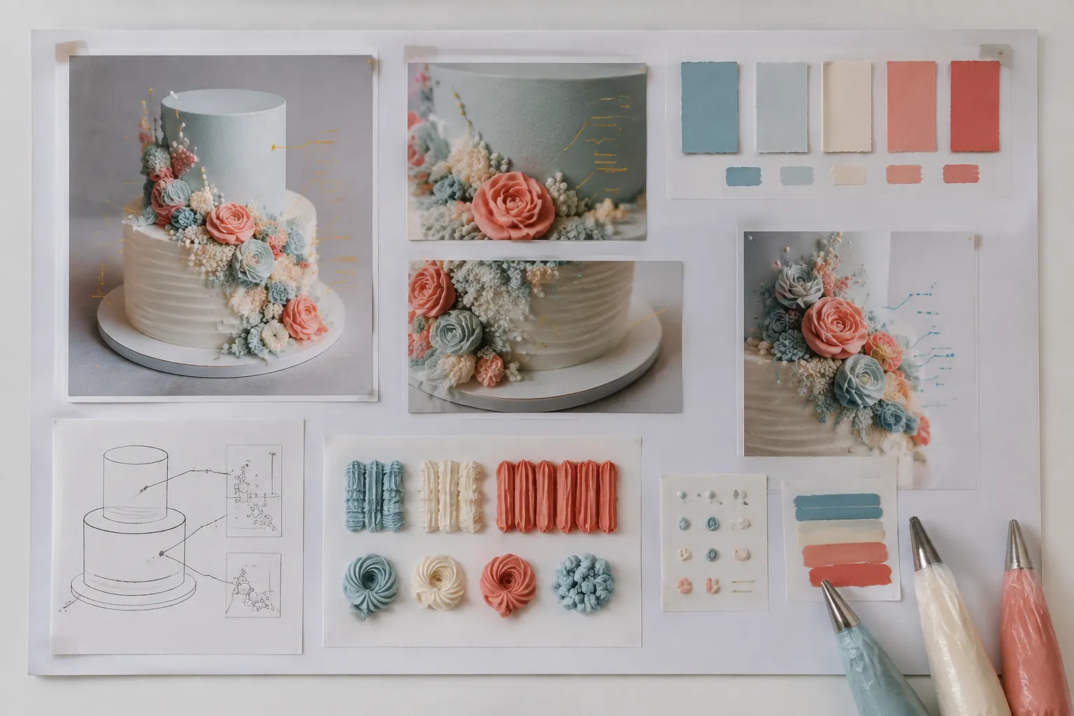
A reference board should separate whole-cake composition from close-up details. CakeVR describes photographs, collages, sketches, messages, samples, and physical models as communication tools with different strengths. A detail collage may clarify texture while leaving the complete profile unresolved.
- Whole-cake image: silhouette, tier ratio, broad palette, focal hierarchy, and placement
- Close-up image: piping shape, edge finish, texture, lettering, or motif detail
- Sketch: intended arrangement and proportion, with limited information about final texture
- Illustrative or generated preview: a non-final direction that still needs feasibility review
- Photographed finished cake: visible evidence of one result, not a commitment for another order
Label the requested feature from each image. For example: use the silhouette from one reference, the muted palette from another, and the sparse lower-edge placement from a third. Exclude figures and lettering, but retain one recognizable star as the only literal cue.
What the Preview Leaves Open
Pastry photographs can prompt expectations beyond what they visibly establish. “Eating with Your Eyes First”: Cross-Cultural Evaluation of Visual Expectations Generated by High-End Pastry supports this narrow distinction: appearance can shape sensory expectations without verifying hidden properties.
A preview can communicate form, proportion, palette, finish, motif scale, piping density, spacing, placement, and thematic directness. It cannot by itself establish ingredients, allergen information, flavor, internal supports, storage needs, transport requirements, servings, decoration suitability, price, availability, delivery performance, venue acceptance, or correspondence with the produced cake.
Those order-specific points need separate confirmation from the producing bakery, venue, or relevant product documentation.
Themed Cake Handoff Checklist
- Choose literal, subtle, or a restrained base with one direct focal detail.
- Name the symbol that must remain recognizable and details that should not appear.
- Record the silhouette, tier ratio, and main viewing side.
- Assign dominant, secondary, and accent colors.
- Specify the base finish and top and lower edge treatments.
- Define piping density, motif scale, repetition, and open surface.
- Mark the focal detail, placement, and lettering priority.
- Assign each reference to a specific requested feature.
- Label generated or illustrative previews as non-final.
- Ask what requires adaptation and what remains unresolved for the order.
Mark how the theme should communicate: direct recognition, coordinated suggestion, or one unmistakable detail on a restrained surface. Then replace broad adjectives with instructions about silhouette, finish, density, scale, spacing, and placement.