
Where to Place an Accent Color on a Cake
Place a cake accent color where it can carry the intended visual weight without competing with the main silhouette. For many briefs, a narrow border or controlled piping line is a useful starting point because it defines an edge with limited color coverage.
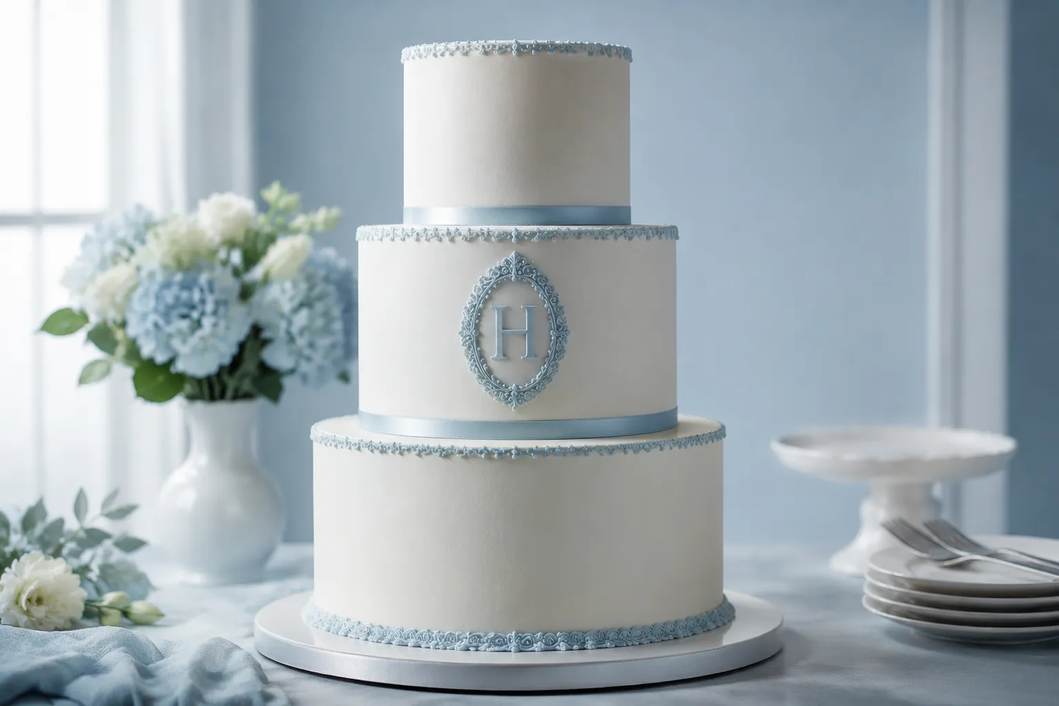
Choose flowers or one focal detail when the color should direct attention to a specific area. Use repeated texture when the accent should become part of the surface rhythm, and use a larger area of one tier only when the color needs to change the balance of the whole profile.
There is no universal cake accent color placement rule. The practical choice depends on where the color will be seen, how large it will appear, and how often it should repeat.
Compare the Main Cake Accent Placements
A Narrow Border or Piping Line
A narrow border can sit along the upper edge, lower edge, or another defined boundary. Piping may form a line, bead, shell, rope, or ridged edge, depending on the selected tip and finish.
This placement gives the accent clear edge definition with relatively little visual coverage. It can make a tier boundary easier to read when the base finish is neutral or lightly textured.
Specify:
- Upper edge, lower edge, or both
- Continuous line or separated sections
- Fine, medium, or heavy piping density
- Smooth, ridged, beaded, or shell-like texture
- Color intensity against the cake finish
- Whether the border repeats on every tier
A lower border can anchor a tier, while an upper border can frame its top surface. Using both may give the color more weight than expected, especially on a small cake or a closely stacked arrangement.
A decorative border is separate from the cake board beneath a tier. The board is a support element; the border is visible decoration.
Flowers or a Concentrated Focal Detail
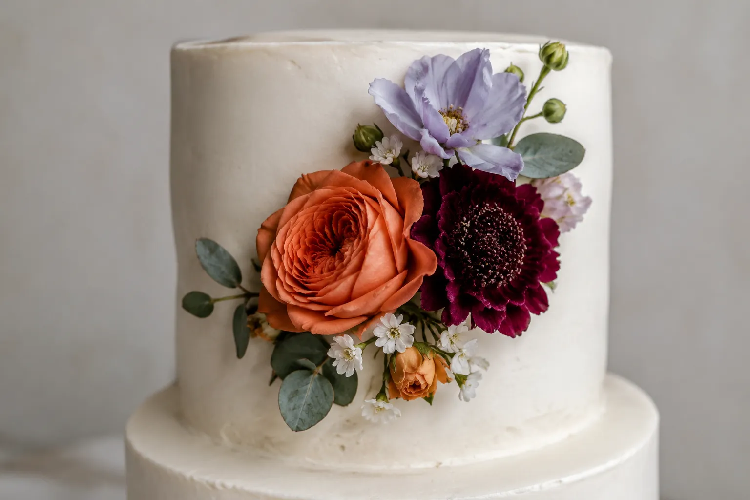
Flowers, petals, leaves, bows, or another concentrated detail make the accent more directional. The color appears in a defined cluster instead of along a complete edge or broad surface.
This option suits a brief in which the accent should feel bold or noticeable without covering much of the cake. The reference should show the cluster's approximate location, width, and relationship to the front-facing view.
Specify:
- One cluster, a floral border, or separate details
- Front-facing, offset, diagonal, or tier-spanning placement
- Individual flower scale
- Open spacing or dense grouping
- Matte, glossy, smooth, or textured finish
- Whether the accent appears in petals, centers, leaves, or all components
A photograph may show color, spacing, scale, and surface texture. It usually cannot establish whether a floral detail is buttercream, gum paste, fondant, or another material. Ask the producing bakery to confirm the material and finish before treating the reference as a production instruction.
A Topper-Adjacent Focal Detail
A small accent near a topper, inscription, figurine, or other upper focal point can connect the top of the cake to the lower tiers. It is more concentrated than a full border and more positional than repeated surface texture.
This placement can support an existing focal detail, but it may compete with the topper when both use strong color, high contrast, or a similar visual scale.
Specify:
- Distance from the topper or inscription
- Whether the accent sits behind, below, or beside it
- Visible width from the front
- Contrast between the accent and the topper
- Whether the accent repeats lower on the cake
The key check is hierarchy. If the topper remains primary, the accent should be smaller, quieter, or more widely spaced. If both details should share attention, state that in the brief.
Repeated Texture Across a Surface
Repeated texture distributes the accent across part or all of a tier. Examples include an ombre petal pattern, rows of piped texture, or another repeated finish.
Here, color and surface treatment work together. That gives the accent more visual weight than a narrow line, so the brief should describe texture and color as one decision.
Specify:
- Full-tier or partial-tier coverage
- Horizontal, vertical, diagonal, or irregular repetition
- Number of visible color changes
- Soft transition or clear color blocks
- Texture direction and density
- Start and end points of the pattern
- Whether the same texture appears on other tiers
The surface may read differently at close range than it does in a full-cake photograph. Ask the bakery to confirm the finish, piping density, color transition, and expected scale.
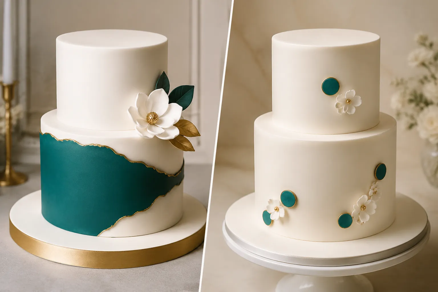
A Larger Area of One Tier
A larger accent area can occupy part or most of one tier surface. This makes the color a structural part of the composition rather than a small highlight.
Use this placement when the accent should affect the overall profile, tier ratio, or balance between tiers. It leaves less room for the base color to act as the dominant field.
Specify:
- Which tier receives the accent
- Approximate vertical coverage
- Full circumference or front-facing section
- Straight boundary, fade, texture change, or irregular edge
- Relationship to adjacent tiers
- Whether the accent repeats elsewhere
A larger color area can appear heavier than the same color used in piping or flowers. Compare the accent against the visible cake surface, not only against a cropped reference image.
How Placement Changes Visual Weight
The same cake accent color can produce different results depending on its location and coverage.
| Placement | Main visible effect | Detail to control |
|---|---|---|
| Narrow border | Edge definition and tier separation | Line width and piping density |
| Flowers | Local focal emphasis | Cluster size and spacing |
| Topper-adjacent detail | Support for an upper focal point | Distance and contrast |
| Repeated texture | Surface rhythm and broader color presence | Pattern density and transition |
| Larger tier surface | Change to overall balance | Coverage and boundary shape |
These are visual-planning comparisons, not tested rankings. Pastry-design and food-presentation materials discuss hue relationships, value, saturation, contrast, and strategic placement, but they do not establish a controlled rule for finished celebration cakes.
Color intensity also changes the perceived weight. A saturated accent may read heavier than a muted version of the same hue, while a light accent against a dark base differs from a dark accent against a pale base.
Translate preference words into visible instructions:
- Dramatic: high contrast, concentrated placement, or stronger color intensity
- Luxury: limited repetition, controlled spacing, and a defined finish
- Soft: lower contrast, lighter intensity, and wider spacing
- Bold: larger scale, denser repetition, or stronger value contrast
- Neutral: restrained base with the accent carrying most of the color variation
Should the Accent Repeat Across Tiers?
Repeat the accent when the cake needs a connected rhythm. Keep it concentrated on one tier when the design needs a clearer focal area.
A repeated border can connect tiers through spacing and edge definition. Repeated flowers may create diagonal movement or a front-facing cluster, while repeated texture gives the color more overall weight and can reduce the distinction between individual tiers.
Before repeating the accent, check:
- Whether each tier has enough visible space
- Whether the color will align or alternate
- Whether repetition should be identical or varied
- Whether one tier should remain visually quiet
- Whether the accent competes with lettering or a topper
- Whether the cake is viewed mainly from the front, side, or all around
A reference photograph can suggest repetition, but it does not establish the cake's full circumference, viewing angle, or complete decoration plan.
What a Cake Photo Cannot Confirm
A reference image can communicate accent location, relative scale, spacing, edge shape, surface texture, approximate color relationship, and repetition across visible tiers.
It cannot confirm ingredients, allergens, whether a colorant is edible or suitable for food contact, the material used for flowers or toppers, structural stability, storage requirements, transport performance, serving yield, price, availability, venue acceptance, or whether the finished result will reproduce the reference.
If the brief includes edible glitter, metallic decoration, dust, wires, toppers, or a specific colorant, ask the producing bakery to verify the exact product, labeling, intended food use, and current applicable requirements. Visual planning and food-contact confirmation are separate decisions.
Turn the Choice Into a Bakery Brief
Name the placement before naming the mood. A useful brief states the location, scale, spacing, finish, repetition, and the details that still need producer confirmation.
Use [accent color] on [specific location]. Keep the color [light, muted, saturated, or high-contrast] against a [base color or finish]. Make the detail [scale], with [open or dense] spacing and a [smooth or textured] finish. Repeat it on [named tiers or details], while leaving [quiet areas] free of the accent. Please confirm the material, colorant suitability, piping density, final scale, and any transport or venue constraints.
For example:
Use a deep blue accent on the lower edge of the middle tier as a narrow, continuous piped border. Keep the line fine and clearly separated from the upper tier. Repeat a smaller version beneath the topper, with no blue on the floral details. Please confirm the finish, color intensity, material, and whether the spacing remains visible at the requested cake size.
This wording gives the bakery a location, scale, edge, spacing, repetition plan, and finish direction. Mark the visible choice, then leave material, feasibility, colorant, transport, and venue questions for the responsible producer to confirm.
Sources
- A Spectrum of Options: Color Theory in Dessert Design | Pastry Arts
- Layered food designs to create appetizing desserts: A proof-of-concept study
- How Color-Harmony on a Food Plate Affects Consumers’ Perceptions?
- Color Additives in Foods | FDA
- CPG Sec 545.200 Confectionery Decorations (Nutritive and Non-Nutritive) | FDA